EditorSender Input Box 🌺
Introduction
EditorSender is here! 🙊 Designed specifically for multimodal models and custom prompt scenarios, this input box component solves core development needs such as tag insertion, content mentions, and custom prompt input, better showcasing the power of multimodal functionality.
📌 Warning
There are certain development differences between the EditorSender component and the Sender component. Please choose according to your actual needs.
Code Demonstrations
Basic Usage
This is an EditorSender input box, the simplest usage example.
<template>
  <EditorSender />
</template>2
3
Placeholder Text
Set the placeholder text of the input box via placeholder.
<template>
  <EditorSender placeholder="💌 Welcome to Element-Plus-X ~" />
</template>2
3
Auto Focus
Set input box auto focus via auto-focus property. It will automatically focus after the input box is generated.
<template>
  <EditorSender :auto-focus="true" />
</template>2
3
State Properties
You can implement component states through simple properties.
💌 Info
- Through the
loadingproperty, you can control the loading state of the built-in button in the input box. - Through the
disabledproperty, you can control whether the built-in button of the input box is disabled. - Through the
clearableproperty, you can control whether the input box shows a delete button to clear the content.
<script setup lang="ts">
import type { SubmitResult } from 'vue-element-plus-x/types/EditorSender';

function handleSubmit(value: SubmitResult) {
  console.log(value);
}
</script>

<template>
  <div style="display: flex; flex-direction: column; gap: 12px">
    <EditorSender loading placeholder="Loading..." @submit="handleSubmit" />
    <EditorSender placeholder="Disabled" disabled @submit="handleSubmit" />
    <EditorSender clearable @submit="handleSubmit" />
  </div>
</template>2
3
4
5
6
7
8
9
10
11
12
13
14
15
Variant - Vertical Style
Set the variant of the input box via the variant property. [ Default 'default' | Vertical layout 'updown' ]
This property changes the input box from a left-right layout to a vertical layout. The top part is the input box, and the bottom part is the built-in prefix and action list bar.
<script setup lang="ts">
import { ElementPlus, Paperclip, Promotion } from '@element-plus/icons-vue';

const isSelect = ref(false);
const tabPosition = ref<'default' | 'updown'>('default');
</script>

<template>
  <div style="display: flex; flex-direction: column; gap: 20px">
    <el-radio-group v-model="tabPosition">
      <el-radio-button value="default"> default </el-radio-button>
      <el-radio-button value="updown"> updown </el-radio-button>
    </el-radio-group>

    <EditorSender :variant="tabPosition" clearable />

    <EditorSender :variant="tabPosition">
      <template #prefix>
        <div
          style="display: flex; align-items: center; gap: 8px; flex-wrap: wrap"
        >
          <el-button round plain color="#626aef">
            <el-icon><Paperclip /></el-icon>
          </el-button>

          <div
            :class="{ isSelect }"
            style="
              display: flex;
              align-items: center;
              gap: 4px;
              padding: 2px 12px;
              border: 1px solid silver;
              border-radius: 15px;
              cursor: pointer;
              font-size: 12px;
            "
            @click="isSelect = !isSelect"
          >
            <el-icon><ElementPlus /></el-icon>
            <span>Deep Thinking</span>
          </div>
        </div>
      </template>

      <template #action-list>
        <div style="display: flex; align-items: center; gap: 8px">
          <el-button round color="#626aef">
            <el-icon><Promotion /></el-icon>
          </el-button>
        </div>
      </template>
    </EditorSender>
  </div>
</template>

<style scoped lang="scss">
.isSelect {
  color: #626aef;
  border: 1px solid #626aef !important;
  border-radius: 15px;
  padding: 3px 12px;
  font-weight: 700;
}
</style>2
3
4
5
6
7
8
9
10
11
12
13
14
15
16
17
18
19
20
21
22
23
24
25
26
27
28
29
30
31
32
33
34
35
36
37
38
39
40
41
42
43
44
45
46
47
48
49
50
51
52
53
54
55
56
57
58
59
60
61
62
63
64
65
Custom Action List
Use the #action-list slot to customize the action list content of the input box. You can combine it with the getCurrentValue method of the component Ref instance to get the current value of the input box.
📌 Warning
Before version 1.0.81, when using custom slots, the built-in action buttons would be sacrificed. In version 1.0.81, we introduced streaming request hooks that allow users to better control streaming requests and thus better define their own #action-list slots. For details, please check out our project template's recommended request library, comparable to Axios: hook-fetch.
This friendly reminder was updated on: 2025-08-06
💌 Info
When you use the #action-list slot, the built-in input box action buttons will be hidden. You can combine it with component instance methods to implement richer operations.
<script setup lang="ts">
import { Loading, Position } from '@element-plus/icons-vue';

const senderRef = ref();
const loading = ref(false);

function handleSubmit() {
  // Get the current content of the input box
  const senderValue = senderRef.value.getCurrentValue();
  console.log('senderValue', senderValue);
  if (!senderValue.text) {
    ElMessage.warning('Please enter content');
    return;
  }
  loading.value = true;
}

function handleCancel() {
  console.log('cancel');
  loading.value = false;
}
</script>

<template>
  <div style="display: flex; flex-direction: column; gap: 12px">
    <EditorSender ref="senderRef">
      <!-- Custom action list -->
      <template #action-list>
        <div class="action-list-self-wrap">
          <el-button
            v-if="loading"
            type="primary"
            plain
            circle
            @click="handleCancel"
          >
            <el-icon class="is-loaidng">
              <Loading />
            </el-icon>
          </el-button>

          <el-button v-else plain circle @click="handleSubmit">
            <el-icon><Position /></el-icon>
          </el-button>
        </div>
      </template>
    </EditorSender>
  </div>
</template>

<style scoped lang="less">
.action-list-self-wrap {
  display: flex;
  align-items: center;
  & > span {
    width: 120px;
    font-weight: 600;
    color: var(--el-color-primary);
  }
}

.is-loaidng {
  animation: spin 1s linear infinite;
}

@keyframes spin {
  0% {
    transform: rotate(0deg);
  }
  100% {
    transform: rotate(360deg);
  }
}
</style>2
3
4
5
6
7
8
9
10
11
12
13
14
15
16
17
18
19
20
21
22
23
24
25
26
27
28
29
30
31
32
33
34
35
36
37
38
39
40
41
42
43
44
45
46
47
48
49
50
51
52
53
54
55
56
57
58
59
60
61
62
63
64
65
66
67
68
69
70
71
72
73
74
Custom Prefix
Use the #prefix slot to customize the prefix content of the input box.
<script setup lang="ts">
import { Link } from '@element-plus/icons-vue';

const senderRef = ref();
</script>

<template>
  <div
    style="
      display: flex;
      flex-direction: column;
      gap: 12px;
      justify-content: flex-end;
    "
  >
    <EditorSender ref="senderRef">
      <!-- Custom Prefix -->
      <template #prefix>
        <div class="prefix-self-wrap">
          <el-button dark>
            <el-icon><Link /></el-icon>
            <span>Custom Prefix</span>
          </el-button>
        </div>
      </template>
    </EditorSender>
  </div>
</template>

<style scoped lang="less">
.header-self-wrap {
  display: flex;
  flex-direction: column;
  padding: 16px;
  height: 200px;
  .header-self-title {
    width: 100%;
    display: flex;
    height: 30px;
    align-items: center;
    justify-content: space-between;
    padding-bottom: 8px;
  }
  .header-self-content {
    flex: 1;
    display: flex;
    align-items: center;
    justify-content: center;
    font-size: 20px;
    color: #626aef;
    font-weight: 600;
  }
}

.prefix-self-wrap {
  display: flex;
}
</style>2
3
4
5
6
7
8
9
10
11
12
13
14
15
16
17
18
19
20
21
22
23
24
25
26
27
28
29
30
31
32
33
34
35
36
37
38
39
40
41
42
43
44
45
46
47
48
49
50
51
52
53
54
55
56
57
58
Custom Header
Use the #header slot to customize the header content of the input box. You can also set the header animation time through the headerAnimationTimer property.
<script setup lang="ts">
import { CircleClose } from '@element-plus/icons-vue';

const senderRef = ref();
const showHeaderFlog = ref(false);

onMounted(() => {
  showHeaderFlog.value = true;
});

function openCloseHeader() {
  showHeaderFlog.value = !showHeaderFlog.value;
}

function closeHeader() {
  showHeaderFlog.value = false;
}
</script>

<template>
  <div
    style="
      display: flex;
      flex-direction: column;
      gap: 12px;
      height: 230px;
      justify-content: flex-end;
    "
  >
    <EditorSender ref="senderRef" :header-animation-timer="500">
      <template v-if="showHeaderFlog" #header>
        <div class="header-self-wrap">
          <div class="header-self-title">
            <div class="header-left">💯 Welcome to Element Plus X</div>
            <div class="header-right">
              <el-button @click.stop="closeHeader">
                <el-icon><CircleClose /></el-icon>
                <span>Close Header</span>
              </el-button>
            </div>
          </div>
          <div class="header-self-content">🦜 Custom Header Content</div>
        </div>
      </template>

      <!-- Custom Prefix -->
      <template #prefix>
        <div class="prefix-self-wrap">
          <el-button color="#626aef" :dark="true" @click="openCloseHeader">
            Open/Close Header
          </el-button>
        </div>
      </template>
    </EditorSender>
  </div>
</template>

<style scoped lang="less">
.header-self-wrap {
  display: flex;
  flex-direction: column;
  padding: 16px;
  height: 200px;
  .header-self-title {
    width: 100%;
    display: flex;
    height: 30px;
    align-items: center;
    justify-content: space-between;
    padding-bottom: 8px;
  }
  .header-self-content {
    flex: 1;
    display: flex;
    align-items: center;
    justify-content: center;
    font-size: 20px;
    color: #626aef;
    font-weight: 600;
  }
}

.prefix-self-wrap {
  display: flex;
}
</style>2
3
4
5
6
7
8
9
10
11
12
13
14
15
16
17
18
19
20
21
22
23
24
25
26
27
28
29
30
31
32
33
34
35
36
37
38
39
40
41
42
43
44
45
46
47
48
49
50
51
52
53
54
55
56
57
58
59
60
61
62
63
64
65
66
67
68
69
70
71
72
73
74
75
76
77
78
79
80
81
82
83
84
85
86
Custom Footer
Set the footer content of the input box through the #footer slot
<script setup lang="ts">
import { ElementPlus, Paperclip, Promotion } from '@element-plus/icons-vue';

const isSelect = ref(false);
</script>

<template>
  <div style="display: flex; flex-direction: column; gap: 20px">
    <EditorSender clearable>
      <template #prefix>
        <div
          style="display: flex; align-items: center; gap: 8px; flex-wrap: wrap"
        >
          <el-button round plain color="#626aef">
            <el-icon><Paperclip /></el-icon>
          </el-button>
        </div>
      </template>

      <template #action-list>
        <div style="display: flex; align-items: center; gap: 8px">
          <el-button round color="#626aef">
            <el-icon><Promotion /></el-icon>
          </el-button>
        </div>
      </template>

      <!-- Custom Footer Slot -->
      <template #footer>
        <div
          style="
            display: flex;
            align-items: center;
            justify-content: center;
            padding: 12px;
          "
        >
          Default Variant Custom Footer
        </div>
      </template>
    </EditorSender>

    <EditorSender variant="updown" clearable>
      <template #prefix>
        <div
          style="display: flex; align-items: center; gap: 8px; flex-wrap: wrap"
        >
          <el-button round plain color="#626aef">
            <el-icon><Paperclip /></el-icon>
          </el-button>

          <div
            :class="{ isSelect }"
            style="
              display: flex;
              align-items: center;
              gap: 4px;
              padding: 2px 12px;
              border: 1px solid silver;
              border-radius: 15px;
              cursor: pointer;
              font-size: 12px;
            "
            @click="isSelect = !isSelect"
          >
            <el-icon><ElementPlus /></el-icon>
            <span>Deep Thinking</span>
          </div>
        </div>
      </template>

      <template #action-list>
        <div style="display: flex; align-items: center; gap: 8px">
          <el-button round color="#626aef">
            <el-icon><Promotion /></el-icon>
          </el-button>
        </div>
      </template>

      <!-- Custom Footer Slot -->
      <template #footer>
        <div
          style="
            display: flex;
            align-items: center;
            justify-content: center;
            padding: 12px;
          "
        >
          Updown Variant Custom Footer
        </div>
      </template>
    </EditorSender>
  </div>
</template>

<style scoped lang="scss">
.isSelect {
  color: #626aef;
  border: 1px solid #626aef !important;
  border-radius: 15px;
  padding: 3px 12px;
  font-weight: 700;
}
</style>2
3
4
5
6
7
8
9
10
11
12
13
14
15
16
17
18
19
20
21
22
23
24
25
26
27
28
29
30
31
32
33
34
35
36
37
38
39
40
41
42
43
44
45
46
47
48
49
50
51
52
53
54
55
56
57
58
59
60
61
62
63
64
65
66
67
68
69
70
71
72
73
74
75
76
77
78
79
80
81
82
83
84
85
86
87
88
89
90
91
92
93
94
95
96
97
98
99
100
101
102
103
104
105
Custom Input Box Style
Easily control the style of the input box through customStyle. You can set maxHeight to limit the height of the input box, which will display a scrollbar when the content exceeds the specified height.
<script setup lang="ts"></script>

<template>
  <div style="display: flex; flex-direction: column; gap: 20px">
    <EditorSender
      variant="updown"
      :custom-style="{
        fontSize: '24px',
        fontWeight: 700,
        maxHeight: '100px'
      }"
      style="
        background-image: linear-gradient(to left, #7fffaa 0%, #00ffff 100%);
        border-radius: 8px;
      "
    />

    <EditorSender
      :custom-style="{
        fontSize: '24px',
        fontWeight: 700,
        maxHeight: '200px',
        minHeight: '100px'
      }"
      style="
        background-image: linear-gradient(
          to top,
          #fdcbf1 0%,
          #fdcbf1 1%,
          #e6dee9 100%
        );
        border-radius: 8px;
      "
    />
  </div>
</template>

<style scoped lang="scss">
.isSelect {
  color: #626aef !important;
  border: 1px solid #626aef !important;
  border-radius: 15px;
  padding: 3px 12px;
  font-weight: 700;
}
</style>2
3
4
5
6
7
8
9
10
11
12
13
14
15
16
17
18
19
20
21
22
23
24
25
26
27
28
29
30
31
32
33
34
35
36
37
38
39
40
41
42
43
44
45
46
Maximum Input Length
Limit the maximum number of characters in the input box via maxLength.
💔 Danger
This configuration has a relatively high performance cost. Please do not set it unless necessary (like Doubao and Wenxin Yiyan, which do not limit this). Do not sacrifice major functions for minor features.
<template>
  <EditorSender :max-length="10" />
</template>2
3
Submission Methods
Control line break and submit mode through submitType. Default is 'enter', which means Enter to submit and 'shift + Enter' to line break.
💌 Info
submitType='enter'sets Enter to submit and'shift + Enter'to line break.submitType='shiftEnter'sets'shift + Enter'to submit and Enter to line break.
<script setup lang="ts">
import type {
  EditorProps,
  SubmitResult
} from 'vue-element-plus-x/types/EditorSender';

const activeName = ref<EditorProps['submitType']>('enter');
const senderLoading = ref(false);
function handleSubmit(value: SubmitResult) {
  ElMessage.info(`Sending`);
  senderLoading.value = true;
  setTimeout(() => {
    // You can check the printed result in the console
    console.log('submit-> value:', value);
    senderLoading.value = false;
    ElMessage.success(`Sent successfully`);
  }, 2000);
}
</script>

<template>
  <div style="display: flex; flex-direction: column; gap: 12px">
    <el-radio-group v-model="activeName">
      <el-radio-button value="enter"> enter </el-radio-button>
      <el-radio-button value="shiftEnter"> shiftEnter </el-radio-button>
    </el-radio-group>

    <EditorSender
      :submit-type="activeName"
      :loading="senderLoading"
      @submit="handleSubmit"
    />
  </div>
</template>2
3
4
5
6
7
8
9
10
11
12
13
14
15
16
17
18
19
20
21
22
23
24
25
26
27
28
29
30
31
32
33
34
Advanced Usage
Insert Text Content
Use the component Ref to call the setText method to insert text content at the cursor position.
<script setup lang="ts">
import { ref } from 'vue';

const senderRef = ref();
</script>

<template>
  <div style="display: flex; flex-direction: column; gap: 12px">
    <div style="display: flex">
      <el-button
        dark
        type="primary"
        plain
        @click="senderRef?.setText('💖 Welcome to Element Plus X ')"
      >
        Insert Text Content
      </el-button>
    </div>
    <EditorSender ref="senderRef" clearable />
  </div>
</template>2
3
4
5
6
7
8
9
10
11
12
13
14
15
16
17
18
19
20
21
Insert HTML Content
Use the component Ref to call the setHtml method to insert HTML content at the cursor position.
📌 Warning
The inserted HTML tags must be inline or inline-block elements. If you need block-level element tags, please insert inline elements and then modify their CSS properties to block-level elements.
<script setup lang="ts">
import { ref } from 'vue';

const senderRef = ref();
function setHtml() {
  senderRef.value?.setHtml(
    `<img class="img-tag" src="https://cdn.element-plus-x.com/element-plus-x.png" alt="">`
  );
}
</script>

<template>
  <div style="display: flex; flex-direction: column; gap: 12px">
    <div style="display: flex">
      <el-button dark type="primary" plain @click="setHtml">
        Insert HTML Content
      </el-button>
    </div>
    <EditorSender ref="senderRef" clearable />
  </div>
</template>

<style scoped lang="less">
:deep(.img-tag) {
  width: 24px;
  height: 24px;
  vertical-align: bottom;
  display: inline-block;
}
</style>2
3
4
5
6
7
8
9
10
11
12
13
14
15
16
17
18
19
20
21
22
23
24
25
26
27
28
29
30
Insert Select Tag
Configure the select tag configuration array via the selectList property.
Use the component Ref to call the setSelectTag method to insert select tag content at the cursor position. This method accepts two parameters: the first is the identifier of the select tag, and the second is the option identifier (default value) of the select tag.
💌 Info
You can also call the openSelectDialog method from outside to open the select tag popup. This method accepts a configuration object with the following type:
interface SelectDialogOption {
  key: string;
  elm: HTMLElement;
  beforeText?: string;
  afterText?: string;
}2
3
4
5
6
Expand to view configuration array type
interface SelectTag {
  dialogTitle: string, // Select tag popup title
  key: string, // Select tag identifier, used when inserting select tags
  options: SelectItem[] // Select tag options array
}

interface SelectItem {
  id: string, // Select tag option identifier
  name: string, // Select tag option name
  preview?: string | URL // Select tag option preview image
}2
3
4
5
6
7
8
9
10
11
<script setup lang="ts">
import type {
  SelectDialogOption,
  SelectTag
} from 'vue-element-plus-x/types/EditorSender';
import { ref } from 'vue';

const senderRef = ref();

const selectTagsArr = ref<SelectTag[]>([
  {
    dialogTitle: 'Style Selection',
    key: 'style',
    options: [
      {
        id: '1',
        name: 'Portrait Photography',
        preview: 'https://www.jianfv.top/style/style1.webp'
      },
      {
        id: '2',
        name: 'Film Photography',
        preview: 'https://www.jianfv.top/style/style2.webp'
      },
      {
        id: '3',
        name: 'Chinese Style',
        preview: 'https://www.jianfv.top/style/style3.webp'
      }
    ]
  },
  {
    dialogTitle: 'Font Selection',
    key: 'font',
    options: [
      { id: '1', name: 'SimSun' },
      { id: '2', name: 'Microsoft YaHei' },
      { id: '3', name: 'KaiTi' }
    ]
  }
]);

function openSelectDialog() {
  senderRef.value?.openSelectDialog({
    key: 'style',
    elm: document.getElementById('dialogBtn')!,
    beforeText: '[Custom Prefix Content]',
    afterText: '[Custom Suffix Content]'
  } as SelectDialogOption);
}
</script>

<template>
  <div style="display: flex; flex-direction: column; gap: 12px">
    <div style="display: flex">
      <el-button
        dark
        type="primary"
        plain
        @click="senderRef?.setSelectTag('style', '1')"
      >
        Insert Style Select Tag
      </el-button>
      <el-button
        dark
        type="primary"
        plain
        @click="senderRef?.setSelectTag('font', '2')"
      >
        Insert Font Select Tag
      </el-button>
      <el-button
        id="dialogBtn"
        dark
        type="primary"
        plain
        @click="openSelectDialog"
      >
        External Call Select Tag Popup
      </el-button>
    </div>
    <EditorSender ref="senderRef" :select-list="selectTagsArr" clearable />
  </div>
</template>

<style scoped lang="less">
:deep(.at-select) {
  cursor: pointer;
  svg {
    display: inline-block;
  }
}
</style>2
3
4
5
6
7
8
9
10
11
12
13
14
15
16
17
18
19
20
21
22
23
24
25
26
27
28
29
30
31
32
33
34
35
36
37
38
39
40
41
42
43
44
45
46
47
48
49
50
51
52
53
54
55
56
57
58
59
60
61
62
63
64
65
66
67
68
69
70
71
72
73
74
75
76
77
78
79
80
81
82
83
84
85
86
87
88
89
90
91
92
93
Insert Input Tag
Configure the select tag configuration array via the selectList property.
Use the component Ref to call the setInputTag method to insert input tag content at the cursor position.
This method accepts three parameters: the first is the identifier of the input tag (custom defined), the second is the placeholder of the input tag, and the third is the default value of the input tag.
<script setup lang="ts">
import { ref } from 'vue';

const senderRef = ref();
</script>

<template>
  <div style="display: flex; flex-direction: column; gap: 12px">
    <div style="display: flex">
      <el-button
        dark
        type="primary"
        plain
        @click="senderRef?.setInputTag('job', 'Please enter your occupation')"
      >
        Insert Input Tag Without Default Value
      </el-button>
      <el-button
        dark
        type="primary"
        plain
        @click="
          senderRef?.setInputTag(
            'job',
            'Please enter your occupation',
            'Developer'
          )
        "
      >
        Insert Input Tag With Default Value
      </el-button>
    </div>
    <EditorSender ref="senderRef" clearable />
  </div>
</template>

<style scoped lang="less">
:deep(.at-select) {
  cursor: pointer;
  svg {
    display: inline-block;
  }
}
</style>2
3
4
5
6
7
8
9
10
11
12
13
14
15
16
17
18
19
20
21
22
23
24
25
26
27
28
29
30
31
32
33
34
35
36
37
38
39
40
41
42
43
44
Insert User Tag
Configure the user tag configuration array via the userList property. @ triggers the user tag popup.
Use the component Ref to call the setUserTag method to insert user tag content at the cursor position. This method accepts one parameter: the identifier of the user tag. If you want to support pinyin search, please configure the pinyin property for the user tag.
Expand to view configuration array type
interface UserInfo {
  id: string, // User identifier
  name: string, // User name
  avatar?: string | URL, // User avatar
  pinyin?: string // Pinyin of user name, used for search
}2
3
4
5
6
<script setup lang="ts">
import type { UserInfo } from 'vue-element-plus-x/types/EditorSender';
import { ref } from 'vue';

const senderRef = ref();

const userTagsArr = ref<UserInfo[]>([
  { id: '5', name: 'Zhang Sanfeng', pinyin: 'zhang san feng' },
  { id: '1', name: 'Zhang San', pinyin: 'zhang san' },
  { id: '2', name: 'Li Si', pinyin: 'li si' },
  { id: '3', name: 'Wang Wu', pinyin: 'wang wu' },
  {
    id: '4',
    name: 'Hejiayue',
    pinyin: 'he jia yue',
    avatar: 'https://avatars.githubusercontent.com/u/76239030?v=4&size=40'
  }
]);
</script>

<template>
  <div style="display: flex; flex-direction: column; gap: 12px">
    <div style="display: flex">
      <el-button dark type="primary" plain @click="senderRef?.setUserTag('2')">
        Insert User Tag
      </el-button>
    </div>
    <EditorSender
      ref="senderRef"
      :user-list="userTagsArr"
      placeholder="@ symbol triggers user selection"
      clearable
    />
  </div>
</template>

<style scoped lang="less">
:deep(.at-select) {
  cursor: pointer;
  svg {
    display: inline-block;
  }
}
</style>2
3
4
5
6
7
8
9
10
11
12
13
14
15
16
17
18
19
20
21
22
23
24
25
26
27
28
29
30
31
32
33
34
35
36
37
38
39
40
41
42
43
44
Insert Custom Tag
Configure the custom tag configuration array via the customTrigger property.
Use the component Ref to call the setCustomTag method to insert custom tag content at the cursor position. This method accepts two parameters: the first is the identifier prefix of the custom tag, and the second is the id of the tag list item to be inserted.
Expand to view configuration array type
interface CustomTag {
  dialogTitle: string,
  prefix: string,
  tagList: TagInfo[]
}

interface TagInfo {
  id: string,
  name: string,
  pinyin?: string
}2
3
4
5
6
7
8
9
10
11
<script setup lang="ts">
import type { CustomTag } from 'vue-element-plus-x/types/EditorSender';
import { ref } from 'vue';

const senderRef = ref();

const customTagsArr = ref<CustomTag[]>([
  {
    dialogTitle: 'Topic Tags',
    prefix: '#',
    tagList: [
      { id: '1', name: 'Topic 1' },
      { id: '2', name: 'Topic 2' },
      { id: '3', name: 'Topic 3' }
    ]
  },
  {
    dialogTitle: 'File Tags',
    prefix: '/',
    tagList: [
      { id: '1', name: 'File 1' },
      { id: '2', name: 'File 2' },
      { id: '3', name: 'File 3' }
    ]
  }
]);
</script>

<template>
  <div style="display: flex; flex-direction: column; gap: 12px">
    <div style="display: flex">
      <el-button
        dark
        type="primary"
        plain
        @click="senderRef?.setCustomTag('#', '2')"
      >
        Insert Custom Topic Tag
      </el-button>
    </div>

    <EditorSender
      ref="senderRef"
      :custom-trigger="customTagsArr"
      placeholder="# triggers topic selection, / triggers file selection"
      clearable
    />
  </div>
</template>

<style scoped lang="less">
:deep(.at-select) {
  cursor: pointer;

  svg {
    display: inline-block;
  }
}
</style>2
3
4
5
6
7
8
9
10
11
12
13
14
15
16
17
18
19
20
21
22
23
24
25
26
27
28
29
30
31
32
33
34
35
36
37
38
39
40
41
42
43
44
45
46
47
48
49
50
51
52
53
54
55
56
57
58
59
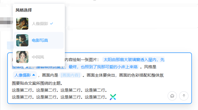
Mixed Tag Override Writing
Set mixed tags via the setMixTags method of the component Ref instance. Mixed tags will overwrite existing content.
<script setup lang="ts">
import type { SelectTag } from 'vue-element-plus-x/types/EditorSender';
import { ref } from 'vue';

const senderRef = ref();

const selectTagsArr = ref<SelectTag[]>([
  {
    dialogTitle: 'Style Selection',
    key: 'style',
    options: [
      {
        id: '1',
        name: 'Portrait Photography',
        preview: 'https://www.jianfv.top/style/style1.webp'
      },
      {
        id: '2',
        name: 'Film Photography',
        preview: 'https://www.jianfv.top/style/style2.webp'
      },
      {
        id: '3',
        name: 'Chinese Style',
        preview: 'https://www.jianfv.top/style/style3.webp'
      }
    ]
  }
]);

function setMixTags() {
  senderRef.value.setMixTags([
    [
      {
        type: 'gridInput',
        value:
          'This is the first line. Please draw a picture based on the following text: '
      },
      {
        type: 'inputTag',
        key: 'content',
        placeholder: '[Text Content]',
        value:
          'The sun shines through that large glass window into the room, first falling on the wall, then reflecting onto the table, and finally, also shining onto my lovely little bed.'
      },
      { type: 'gridInput', value: '. The style is ' },
      { type: 'selectTag', key: 'style', value: '1' },
      { type: 'gridInput', value: ', and the scene includes ' },
      {
        type: 'inputTag',
        key: 'content',
        placeholder: '[Scene Content]',
        value:
          'Light shines through the large French window into the room, illuminating the walls, floor, table, and bed.'
      },
      {
        type: 'gridInput',
        value:
          '. The main subject of the picture should be prominent, and the color matching and overall atmosphere should fit the theme of the text.'
      }
    ],
    [{ type: 'gridInput', value: 'This is the second line. '.repeat(4) }],
    [
      { type: 'gridInput', value: 'This is the third line. '.repeat(4) },
      {
        type: 'htmlTag',
        value:
          '<img class="img-tag" src="https://cdn.element-plus-x.com/element-plus-x.png" alt="">'
      }
    ]
  ]);
}
</script>

<template>
  <div style="display: flex; flex-direction: column; gap: 12px">
    <div style="display: flex">
      <el-button dark type="primary" plain @click="setMixTags">
        Mixed Tag Overwrite
      </el-button>
    </div>

    <EditorSender ref="senderRef" clearable :select-list="selectTagsArr" />
  </div>
</template>

<style scoped lang="less">
:deep(.at-select) {
  cursor: pointer;
  svg {
    display: inline-block;
  }
}
:deep(.img-tag) {
  width: 24px;
  height: 24px;
  vertical-align: bottom;
  display: inline-block;
}
</style>2
3
4
5
6
7
8
9
10
11
12
13
14
15
16
17
18
19
20
21
22
23
24
25
26
27
28
29
30
31
32
33
34
35
36
37
38
39
40
41
42
43
44
45
46
47
48
49
50
51
52
53
54
55
56
57
58
59
60
61
62
63
64
65
66
67
68
69
70
71
72
73
74
75
76
77
78
79
80
81
82
83
84
85
86
87
88
89
90
91
92
93
94
95
96
97
98
99
100
Prefix Prompt Tag
Open and close the prefix tip tag via the openTipTag and closeTipTag methods of the component Ref instance.
<script setup lang="ts">
import { ref } from 'vue';

const senderRef = ref();
</script>

<template>
  <div style="display: flex; flex-direction: column; gap: 12px">
    <div style="display: flex">
      <el-button
        dark
        type="primary"
        plain
        @click="
          senderRef?.openTipTag({
            tagLabel: 'Image Generation',
            popoverLabel: 'Click to exit skill'
          })
        "
      >
        Open Prefix Tip Tag
      </el-button>
      <el-button dark type="primary" plain @click="senderRef?.closeTipTag()">
        Close Prefix Tip Tag
      </el-button>
    </div>

    <EditorSender ref="senderRef" clearable />
  </div>
</template>

<style scoped lang="less">
:deep(.at-select) {
  cursor: pointer;

  svg {
    display: inline-block;
  }
}

:deep(.img-tag) {
  width: 24px;
  height: 24px;
  vertical-align: bottom;
  display: inline-block;
}

/* Style penetration to solve spacing issue between prefix tag and input content */
:deep(.el-editor-sender-content) {
  padding-top: 0 !important;
  .el-editor-sender-chat,
  .chat-tip-wrap,
  .chat-placeholder-wrap,
  .el-editor-sender-action-list-presets {
    padding-top: 12px !important;
  }
}
</style>2
3
4
5
6
7
8
9
10
11
12
13
14
15
16
17
18
19
20
21
22
23
24
25
26
27
28
29
30
31
32
33
34
35
36
37
38
39
40
41
42
43
44
45
46
47
48
49
50
51
52
53
54
55
56
57
58
Asynchronous Loading of @Members
Configure async matching function via asyncMatchFun property. @ triggers user tag popup.
<script setup lang="ts">
import { ref } from 'vue';

const senderRef = ref();

// Async match @users
async function asyncMatchUser(searchVal: string) {
  console.log(searchVal, 'content entered after @');
  // Simulate API call, return user list
  return [
    { id: '1', name: 'Zhang San' },
    { id: '2', name: 'Li Si' }
  ];
}
</script>

<template>
  <div style="display: flex; flex-direction: column; gap: 12px">
    <div style="display: flex">
      <EditorSender
        ref="senderRef"
        placeholder="@ symbol triggers user selection"
        clearable
        :async-match-fun="asyncMatchUser"
      />
    </div>
  </div>
</template>

<style scoped lang="less">
:deep(.at-select) {
  cursor: pointer;
  svg {
    display: inline-block;
  }
}
</style>2
3
4
5
6
7
8
9
10
11
12
13
14
15
16
17
18
19
20
21
22
23
24
25
26
27
28
29
30
31
32
33
34
35
36
37
Custom Mention Popup
Configure async matching function via asyncMatchFun property. @ triggers user tag popup.
<script setup lang="ts">
import type { TagInfo, UserInfo } from 'vue-element-plus-x/types/EditorSender';
import { ref } from 'vue';
import { EditorSender } from 'vue-element-plus-x';

const editorRef = ref<InstanceType<typeof EditorSender>>();
// Custom @popup related logic
const userList = ref([
  { id: '5', name: 'Zhang Sanfeng' },
  { id: '1', name: 'Zhang San' },
  { id: '2', name: 'Li Si' },
  { id: '3', name: 'Wang Wu' },
  { id: '4', name: 'Ma Liu' }
]);
const dialogUserVisible = ref(false);
function showAtDialog() {
  dialogUserVisible.value = true;
}
function checkUser(user: UserInfo) {
  editorRef.value?.customSetUser(user);
  dialogUserVisible.value = false;
}

// Custom trigger symbol related logic
const customTrigger = ref([
  {
    dialogTitle: 'Group Topics',
    prefix: '#',
    tagList: [
      { id: 'ht1', name: 'Topic 1' },
      { id: 'ht2', name: 'Topic 2' }
    ]
  },
  {
    dialogTitle: 'Group Tools',
    prefix: '!',
    tagList: [
      { id: 'gj1', name: 'Tool 1' },
      { id: 'gj2', name: 'Tool 2' }
    ]
  }
]);
const dialogCustomVisible = ref(false);
const viewPrefix = ref('');
function showTagDialog(prefix: string) {
  viewPrefix.value = prefix;
  dialogCustomVisible.value = true;
}
function checkTag(tag: TagInfo) {
  editorRef.value?.customSetTag(viewPrefix.value, tag);
  dialogCustomVisible.value = false;
}

// Custom selection tag related logic
const selectList = ref([
  {
    dialogTitle: 'Style Selection',
    key: 'style',
    options: [
      {
        id: '1',
        name: 'Portrait Photography',
        preview: 'https://www.jianfv.top/style/style1.webp'
      },
      {
        id: '2',
        name: 'Film Photography',
        preview: 'https://www.jianfv.top/style/style2.webp'
      },
      {
        id: '3',
        name: 'Chinese Style',
        preview: 'https://www.jianfv.top/style/style3.webp'
      }
    ]
  }
]);
const viewKey = ref('');
const dialogSelectVisible = ref(false);
const currentSelectElm = ref<HTMLElement>();
function showSelectDialog(key: string, elm?: HTMLElement) {
  viewKey.value = key;
  // elm value indicates internal chat box唤起
  currentSelectElm.value = elm;
  dialogSelectVisible.value = true;
}
function checkSelect(tag: TagInfo) {
  // No currentSelectElm indicates external call for insertion
  if (!currentSelectElm.value) {
    editorRef.value?.setSelectTag(viewKey.value, tag.id);
  } else {
    // Has value for tag update method
    editorRef.value?.updateSelectTag(currentSelectElm.value, tag);
  }
  dialogSelectVisible.value = false;
}
</script>

<template>
  <div style="display: flex; flex-direction: column; gap: 12px">
    <EditorSender
      ref="editorRef"
      placeholder="This is a custom popup, you can try entering @, !, # triggers"
      :custom-style="{ maxHeight: '240px' }"
      :custom-dialog="true"
      :select-list="selectList"
      :user-list="userList"
      :custom-trigger="customTrigger"
      @show-at-dialog="showAtDialog"
      @show-tag-dialog="showTagDialog"
      @show-select-dialog="showSelectDialog"
    />

    <el-dialog
      v-model="dialogUserVisible"
      title="Custom User Selection Popup"
      width="500"
    >
      <p v-for="user of userList" :key="user.id" @click="checkUser(user)">
        {{ user.name }}
      </p>
    </el-dialog>

    <el-dialog
      v-model="dialogCustomVisible"
      title="Custom Trigger Symbol Selection Popup"
      width="500"
    >
      <template v-for="option of customTrigger" :key="option.prefix">
        <div v-if="option.prefix === viewPrefix">
          <p v-for="tag of option.tagList" :key="tag.id" @click="checkTag(tag)">
            {{ tag.name }}
          </p>
        </div>
      </template>
    </el-dialog>

    <el-dialog
      v-model="dialogSelectVisible"
      title="Custom Selection Tag Popup"
      width="500"
    >
      <template v-for="option of selectList" :key="option.key">
        <div v-if="option.key === viewKey">
          <p
            v-for="tag of option.options"
            :key="tag.id"
            @click="checkSelect(tag)"
          >
            {{ tag.name }}
          </p>
        </div>
      </template>
    </el-dialog>
  </div>
</template>

<style scoped lang="less">
:deep(.at-select) {
  cursor: pointer;
  svg {
    display: inline-block;
  }
}
</style>2
3
4
5
6
7
8
9
10
11
12
13
14
15
16
17
18
19
20
21
22
23
24
25
26
27
28
29
30
31
32
33
34
35
36
37
38
39
40
41
42
43
44
45
46
47
48
49
50
51
52
53
54
55
56
57
58
59
60
61
62
63
64
65
66
67
68
69
70
71
72
73
74
75
76
77
78
79
80
81
82
83
84
85
86
87
88
89
90
91
92
93
94
95
96
97
98
99
100
101
102
103
104
105
106
107
108
109
110
111
112
113
114
115
116
117
118
119
120
121
122
123
124
125
126
127
128
129
130
131
132
133
134
135
136
137
138
139
140
141
142
143
144
145
146
147
148
149
150
151
152
153
154
155
156
157
158
159
160
161
162
163
164
165
Device Type (PC/H5)
Set the device type using the device property, default is pc
📌 Warning
When passing h5, pay attention to the interaction of the pop-up selection function and refer to the custom pop-up selection function to implement the interaction
<script setup lang="ts">
import type { UserInfo } from 'vue-element-plus-x/types/EditorSender';
import { EditorSender } from 'vue-element-plus-x';

const senderRef = ref<InstanceType<typeof EditorSender>>();

const userList = ref([
  { id: '5', name: 'Zhang Sanfeng' },
  { id: '1', name: 'Zhang San' },
  { id: '2', name: 'Li Si' },
  { id: '3', name: 'Wang Wu' },
  { id: '4', name: 'Ma Liu' }
]);
const dialogUserVisible = ref(false);
function showAtDialog() {
  dialogUserVisible.value = true;
}
function checkUser(user: UserInfo) {
  senderRef.value?.customSetUser(user);
  dialogUserVisible.value = false;
}
</script>

<template>
  <div style="display: flex; flex-direction: column; gap: 12px">
    <EditorSender
      ref="senderRef"
      placeholder="This is a custom popup. In H5 environment, try typing @ to trigger the user selection popup"
      :custom-style="{ maxHeight: '240px' }"
      :custom-dialog="true"
      :user-list="userList"
      @show-at-dialog="showAtDialog"
    />

    <el-dialog
      v-model="dialogUserVisible"
      title="Custom User Selection Popup"
      width="500"
    >
      <p v-for="user of userList" :key="user.id" @click="checkUser(user)">
        {{ user.name }}
      </p>
    </el-dialog>
  </div>
</template>2
3
4
5
6
7
8
9
10
11
12
13
14
15
16
17
18
19
20
21
22
23
24
25
26
27
28
29
30
31
32
33
34
35
36
37
38
39
40
41
42
43
44
45
Properties
| Property Name | Type | Required | Default Value | Description |
|---|---|---|---|---|
placeholder | String | No | 'Please enter content' | Input box placeholder text |
device | 'pc' | 'h5' | No | 'pc' | Device type using the editor. PC has built-in rich popup selection features; H5 requires custom popup implementation |
autoFocus | Boolean | No | false | Whether to automatically focus on the input box after component mounting |
variant | 'default' | 'updown' | No | 'default' | Input box variant type. 'default' is horizontal layout; 'updown' is vertical layout |
userList | UserInfo[] | No | [] | User list for @mention functionality |
customTrigger | CustomTag[] | No | [] | Extended custom popup trigger configuration list |
selectList | SelectTag[] | No | [] | Configuration list for tag dropdown selection options |
maxLength | Number | No | undefined | Limit the maximum number of characters in the input box. High performance cost, not recommended unless necessary |
submitType | 'enter' | 'shiftEnter' | No | 'enter' | Control line break and submission mode: 'enter' for Enter submit/Shift+Enter line break; 'shiftEnter' for Shift+Enter submit/Enter line break |
customStyle | Record<string, any> | No | {} | Used to modify the style of the input box |
loading | Boolean | No | false | Loading state of the send button. Shows loading animation when true |
disabled | Boolean | No | false | Whether to disable the input box. Disabled boxes cannot be entered or operated |
clearable | Boolean | No | false | Whether to show the clear button |
headerAnimationTimer | Number | No | 300 | Duration of header expansion/collapse animation, in ms |
asyncMatchFun | (searchVal: string) => Promise<UserInfo[]> | No | undefined | Method for asynchronously loading group members, used for remote search in @mention functionality |
customDialog | Boolean | No | false | Whether to enable custom popup. When enabled, internal popups will not be created; popup logic must be implemented manually |
Events
| Event Name | Description | Callback Parameters |
|---|---|---|
submit | Triggered when submitting content | payload: SubmitResult - Contains various submitted content |
change | Triggered when input content changes | None |
cancel | Triggered when canceling loading state | None |
showAtDialog | Triggered when showing @user popup | None |
showSelectDialog | Triggered when showing select tag popup | key: string - Tag key name, elm: HTMLElement - Trigger element |
showTagDialog | Triggered when showing custom tag popup | prefix: string - Tag prefix |
Ref Instance Methods
| Method Name | Type | Description |
|---|---|---|
getCurrentValue | () => SubmitResult | Get the current content of the input box, including text, HTML, and various tag information |
focusToStart | () => void | Focus the cursor to the beginning of the text |
focusToEnd | () => void | Focus the cursor to the end of the text |
blur | () => void | Remove focus from the input box |
selectAll | () => void | Select all content in the input box |
clear | (txt?: string) => void | Clear the input box content. Optional parameter txt is the text to insert after clearing |
setSelectTag | (key: string, tagId: string) => void | Insert a select tag |
setInputTag | (key: string, placeholder: string, defaultValue?: string) => void | Insert an input tag |
setUserTag | (userId: string) => void | Insert a @mention tag |
setCustomTag | (prefix: string, id: string) => void | Insert a custom trigger tag |
setMixTags | (tags: MixTag[][]) => void | Insert multiple tags in a mixed manner |
setHtml | (html: string) => void | Insert HTML snippet at current cursor position (inline or inline-block elements recommended) |
setText | (txt: string) => void | Insert text at current cursor position |
openSelectDialog | (option: SelectDialogOption) => void | Externally call to open tag selection popup |
customSetUser | (user: UserInfo) => void | Write @mention tag in custom popup (private API, automatically truncates trigger) |
customSetTag | (prefix: string, tag: TagInfo) => void | Write custom trigger tag in custom popup (private API, automatically truncates trigger) |
updateSelectTag | (elm: HTMLElement, tag: TagInfo) => void | Update select tag content |
openTipTag | (options: TipOptions) => void | Open prefix prompt tag |
closeTipTag | () => void | Close prefix prompt tag |
chat | ChatArea instance | Exposed chat instance object |
opNode | ChatOperateNode instance | Exposed ChatNode operation object |
chatState | ChatState object | Exposed component state object |
Slots
| Slot Name | Parameters | Description |
|---|---|---|
#header | - | Used for customizing input box header content |
#prefix | - | Used for customizing input box prefix content |
#action-list | - | Used for customizing input box action list content |
#footer | - | Used for customizing input box footer content |
Features
Full-type Tag Engine: Seamlessly supports multiple tag types such as @users, select tags, and custom tags. Tag insertion/update/management is a breeze, meeting complex content tagging needs.
Cross-device Adaptive Interaction: PC has a built-in popup system, while H5 supports custom popups. Automatically adapts to different device operation habits, balancing native experience with customization freedom.