EditorSender 编辑输入框 🌺
介绍
EditorSender 重磅来袭 🙊 专为 多模态模型、自定义提示词场景 设计的输入框组件,解决 标签插入,内容提及,自定义提示词输入 等核心开发需求,更好的展现多模态功能的强大。
📌 Warning
EditorSender 组件 和 Sender 组件 有一定的开发上的差异,请根据实际情况选择使用。
代码演示
基础用法
这是一个EditorSender 输入框,最简单的使用例子。
<template>
  <EditorSender />
</template>2
3
提示语
通过 placeholder 设置输入框的提示语。
<template>
  <EditorSender placeholder="💌 欢迎使用 Element-Plus-X ~" />
</template>2
3
自动聚焦
通过 auto-focus 设置输入框自动聚焦。在输入框生成后自动聚焦
<template>
  <EditorSender :auto-focus="true" />
</template>2
3
状态属性
可以通过简单属性是,实现组件的状态
💌 Info
- 通过
loading属性,可以控制输入框内置按钮加载中。 - 通过
disabled属性,可以控制输入框内置按钮是否禁用。 - 通过
clearable属性,可以控制输入框是否出现删除按钮,实现清空。
<script setup lang="ts">
import type { SubmitResult } from 'vue-element-plus-x/types/EditorSender';

function handleSubmit(value: SubmitResult) {
  console.log(value);
}
</script>

<template>
  <div style="display: flex; flex-direction: column; gap: 12px">
    <EditorSender loading placeholder="加载中..." @submit="handleSubmit" />
    <EditorSender placeholder="禁用" disabled @submit="handleSubmit" />
    <EditorSender clearable @submit="handleSubmit" />
  </div>
</template>2
3
4
5
6
7
8
9
10
11
12
13
14
15
变体-垂直样式
通过 variant 属性设置输入框的变体。[ 默认 'default' | 上下结构 'updown' ]
这个属性,将左右结构的 输入框,变成 上下结构的 输入框。上面为 输入框,下面为 内置的 前缀和操作列表栏
<script setup lang="ts">
import { ElementPlus, Paperclip, Promotion } from '@element-plus/icons-vue';

const isSelect = ref(false);
const tabPosition = ref<'default' | 'updown'>('default');
</script>

<template>
  <div style="display: flex; flex-direction: column; gap: 20px">
    <el-radio-group v-model="tabPosition">
      <el-radio-button value="default"> default </el-radio-button>
      <el-radio-button value="updown"> updown </el-radio-button>
    </el-radio-group>

    <EditorSender :variant="tabPosition" clearable />

    <EditorSender :variant="tabPosition">
      <template #prefix>
        <div
          style="display: flex; align-items: center; gap: 8px; flex-wrap: wrap"
        >
          <el-button round plain color="#626aef">
            <el-icon><Paperclip /></el-icon>
          </el-button>

          <div
            :class="{ isSelect }"
            style="
              display: flex;
              align-items: center;
              gap: 4px;
              padding: 2px 12px;
              border: 1px solid silver;
              border-radius: 15px;
              cursor: pointer;
              font-size: 12px;
            "
            @click="isSelect = !isSelect"
          >
            <el-icon><ElementPlus /></el-icon>
            <span>深度思考</span>
          </div>
        </div>
      </template>

      <template #action-list>
        <div style="display: flex; align-items: center; gap: 8px">
          <el-button round color="#626aef">
            <el-icon><Promotion /></el-icon>
          </el-button>
        </div>
      </template>
    </EditorSender>
  </div>
</template>

<style scoped lang="scss">
.isSelect {
  color: #626aef;
  border: 1px solid #626aef !important;
  border-radius: 15px;
  padding: 3px 12px;
  font-weight: 700;
}
</style>2
3
4
5
6
7
8
9
10
11
12
13
14
15
16
17
18
19
20
21
22
23
24
25
26
27
28
29
30
31
32
33
34
35
36
37
38
39
40
41
42
43
44
45
46
47
48
49
50
51
52
53
54
55
56
57
58
59
60
61
62
63
64
65
自定义操作列表
通过 #action-list 插槽用于自定义输入框的操作列表内容。可以和 组件Ref实例的 getCurrentValue 方法结合使用,获取当前输入框的值。
📌 Warning
1.0.81 版本前,在自定义插槽的时候,会牺牲内置的操作按钮。我们在 1.0.81 版本 推出了流式请求的 hooks,可以让用户更好的控制流式请求,从而更好的自己定义 #action-list 插槽。详情请查看我们的项目模版中主推的一个请求库,对标 Axios hook-fetch。
此温馨提示更新时间:2025-08-06
💌 Info
当你使用 #action-list 插槽时,会隐藏内置的输入框的操作按钮。你可以通过和 组件实例方法 相结合,实现更丰富的操作。
<script setup lang="ts">
import { Loading, Position } from '@element-plus/icons-vue';

const senderRef = ref();
const loading = ref(false);

function handleSubmit() {
  // 获取当前输入框的内容
  const senderValue = senderRef.value.getCurrentValue();
  console.log('senderValue', senderValue);
  if (!senderValue.text) {
    ElMessage.warning('请输入内容');
    return;
  }
  loading.value = true;
}

function handleCancel() {
  console.log('cancel');
  loading.value = false;
}
</script>

<template>
  <div style="display: flex; flex-direction: column; gap: 12px">
    <EditorSender ref="senderRef">
      <!-- 自定义操作列表 -->
      <template #action-list>
        <div class="action-list-self-wrap">
          <el-button
            v-if="loading"
            type="primary"
            plain
            circle
            @click="handleCancel"
          >
            <el-icon class="is-loaidng">
              <Loading />
            </el-icon>
          </el-button>

          <el-button v-else plain circle @click="handleSubmit">
            <el-icon><Position /></el-icon>
          </el-button>
        </div>
      </template>
    </EditorSender>
  </div>
</template>

<style scoped lang="less">
.action-list-self-wrap {
  display: flex;
  align-items: center;
  & > span {
    width: 120px;
    font-weight: 600;
    color: var(--el-color-primary);
  }
}

.is-loaidng {
  animation: spin 1s linear infinite;
}

@keyframes spin {
  0% {
    transform: rotate(0deg);
  }
  100% {
    transform: rotate(360deg);
  }
}
</style>2
3
4
5
6
7
8
9
10
11
12
13
14
15
16
17
18
19
20
21
22
23
24
25
26
27
28
29
30
31
32
33
34
35
36
37
38
39
40
41
42
43
44
45
46
47
48
49
50
51
52
53
54
55
56
57
58
59
60
61
62
63
64
65
66
67
68
69
70
71
72
73
74
自定义前缀
通过 #prefix 插槽用于自定义输入框的前缀内容。
<script setup lang="ts">
import { Link } from '@element-plus/icons-vue';

const senderRef = ref();
</script>

<template>
  <div
    style="
      display: flex;
      flex-direction: column;
      gap: 12px;
      justify-content: flex-end;
    "
  >
    <EditorSender ref="senderRef">
      <!-- 自定义前缀 -->
      <template #prefix>
        <div class="prefix-self-wrap">
          <el-button dark>
            <el-icon><Link /></el-icon>
            <span>自定义前缀</span>
          </el-button>
        </div>
      </template>
    </EditorSender>
  </div>
</template>

<style scoped lang="less">
.header-self-wrap {
  display: flex;
  flex-direction: column;
  padding: 16px;
  height: 200px;
  .header-self-title {
    width: 100%;
    display: flex;
    height: 30px;
    align-items: center;
    justify-content: space-between;
    padding-bottom: 8px;
  }
  .header-self-content {
    flex: 1;
    display: flex;
    align-items: center;
    justify-content: center;
    font-size: 20px;
    color: #626aef;
    font-weight: 600;
  }
}

.prefix-self-wrap {
  display: flex;
}
</style>2
3
4
5
6
7
8
9
10
11
12
13
14
15
16
17
18
19
20
21
22
23
24
25
26
27
28
29
30
31
32
33
34
35
36
37
38
39
40
41
42
43
44
45
46
47
48
49
50
51
52
53
54
55
56
57
58
自定义头部
通过 #header 插槽用于自定义输入框的头部内容。还可以通过 headerAnimationTimer 属性设置头部动画时间。
<script setup lang="ts">
import { CircleClose } from '@element-plus/icons-vue';

const senderRef = ref();
const showHeaderFlog = ref(false);

onMounted(() => {
  showHeaderFlog.value = true;
});

function openCloseHeader() {
  showHeaderFlog.value = !showHeaderFlog.value;
}

function closeHeader() {
  showHeaderFlog.value = false;
}
</script>

<template>
  <div
    style="
      display: flex;
      flex-direction: column;
      gap: 12px;
      height: 230px;
      justify-content: flex-end;
    "
  >
    <EditorSender ref="senderRef" :header-animation-timer="500">
      <template v-if="showHeaderFlog" #header>
        <div class="header-self-wrap">
          <div class="header-self-title">
            <div class="header-left">💯 欢迎使用 Element Plus X</div>
            <div class="header-right">
              <el-button @click.stop="closeHeader">
                <el-icon><CircleClose /></el-icon>
                <span>关闭头部</span>
              </el-button>
            </div>
          </div>
          <div class="header-self-content">🦜 自定义头部内容</div>
        </div>
      </template>

      <!-- 自定义前缀 -->
      <template #prefix>
        <div class="prefix-self-wrap">
          <el-button color="#626aef" :dark="true" @click="openCloseHeader">
            打开/关闭头部
          </el-button>
        </div>
      </template>
    </EditorSender>
  </div>
</template>

<style scoped lang="less">
.header-self-wrap {
  display: flex;
  flex-direction: column;
  padding: 16px;
  height: 200px;
  .header-self-title {
    width: 100%;
    display: flex;
    height: 30px;
    align-items: center;
    justify-content: space-between;
    padding-bottom: 8px;
  }
  .header-self-content {
    flex: 1;
    display: flex;
    align-items: center;
    justify-content: center;
    font-size: 20px;
    color: #626aef;
    font-weight: 600;
  }
}

.prefix-self-wrap {
  display: flex;
}
</style>2
3
4
5
6
7
8
9
10
11
12
13
14
15
16
17
18
19
20
21
22
23
24
25
26
27
28
29
30
31
32
33
34
35
36
37
38
39
40
41
42
43
44
45
46
47
48
49
50
51
52
53
54
55
56
57
58
59
60
61
62
63
64
65
66
67
68
69
70
71
72
73
74
75
76
77
78
79
80
81
82
83
84
85
86
自定义底部
通过 #footer 插槽设置输入框 底部内容
<script setup lang="ts">
import { ElementPlus, Paperclip, Promotion } from '@element-plus/icons-vue';

const isSelect = ref(false);
</script>

<template>
  <div style="display: flex; flex-direction: column; gap: 20px">
    <EditorSender clearable>
      <template #prefix>
        <div
          style="display: flex; align-items: center; gap: 8px; flex-wrap: wrap"
        >
          <el-button round plain color="#626aef">
            <el-icon><Paperclip /></el-icon>
          </el-button>
        </div>
      </template>

      <template #action-list>
        <div style="display: flex; align-items: center; gap: 8px">
          <el-button round color="#626aef">
            <el-icon><Promotion /></el-icon>
          </el-button>
        </div>
      </template>

      <!-- 自定义 底部插槽 -->
      <template #footer>
        <div
          style="
            display: flex;
            align-items: center;
            justify-content: center;
            padding: 12px;
          "
        >
          默认变体 自定义底部
        </div>
      </template>
    </EditorSender>

    <EditorSender variant="updown" clearable>
      <template #prefix>
        <div
          style="display: flex; align-items: center; gap: 8px; flex-wrap: wrap"
        >
          <el-button round plain color="#626aef">
            <el-icon><Paperclip /></el-icon>
          </el-button>

          <div
            :class="{ isSelect }"
            style="
              display: flex;
              align-items: center;
              gap: 4px;
              padding: 2px 12px;
              border: 1px solid silver;
              border-radius: 15px;
              cursor: pointer;
              font-size: 12px;
            "
            @click="isSelect = !isSelect"
          >
            <el-icon><ElementPlus /></el-icon>
            <span>深度思考</span>
          </div>
        </div>
      </template>

      <template #action-list>
        <div style="display: flex; align-items: center; gap: 8px">
          <el-button round color="#626aef">
            <el-icon><Promotion /></el-icon>
          </el-button>
        </div>
      </template>

      <!-- 自定义 底部插槽 -->
      <template #footer>
        <div
          style="
            display: flex;
            align-items: center;
            justify-content: center;
            padding: 12px;
          "
        >
          updown 变体 自定义底部
        </div>
      </template>
    </EditorSender>
  </div>
</template>

<style scoped lang="scss">
.isSelect {
  color: #626aef;
  border: 1px solid #626aef !important;
  border-radius: 15px;
  padding: 3px 12px;
  font-weight: 700;
}
</style>2
3
4
5
6
7
8
9
10
11
12
13
14
15
16
17
18
19
20
21
22
23
24
25
26
27
28
29
30
31
32
33
34
35
36
37
38
39
40
41
42
43
44
45
46
47
48
49
50
51
52
53
54
55
56
57
58
59
60
61
62
63
64
65
66
67
68
69
70
71
72
73
74
75
76
77
78
79
80
81
82
83
84
85
86
87
88
89
90
91
92
93
94
95
96
97
98
99
100
101
102
103
104
105
自定义输入框样式
通过 customStyle 方便对输入框的样式控制,你可以设置 maxHeight 来限制输入框的高度。这样实现在一定的高度下出现滚动条。
<script setup lang="ts"></script>

<template>
  <div style="display: flex; flex-direction: column; gap: 20px">
    <EditorSender
      variant="updown"
      :custom-style="{
        fontSize: '24px',
        fontWeight: 700,
        maxHeight: '100px'
      }"
      style="
        background-image: linear-gradient(to left, #7fffaa 0%, #00ffff 100%);
        border-radius: 8px;
      "
    />

    <EditorSender
      :custom-style="{
        fontSize: '24px',
        fontWeight: 700,
        maxHeight: '200px',
        minHeight: '100px'
      }"
      style="
        background-image: linear-gradient(
          to top,
          #fdcbf1 0%,
          #fdcbf1 1%,
          #e6dee9 100%
        );
        border-radius: 8px;
      "
    />
  </div>
</template>

<style scoped lang="scss">
.isSelect {
  color: #626aef !important;
  border: 1px solid #626aef !important;
  border-radius: 15px;
  padding: 3px 12px;
  font-weight: 700;
}
</style>2
3
4
5
6
7
8
9
10
11
12
13
14
15
16
17
18
19
20
21
22
23
24
25
26
27
28
29
30
31
32
33
34
35
36
37
38
39
40
41
42
43
44
45
46
限制最大输入长度
通过 maxLength 限制输入框最大字数。
💔 Danger
该配置项性能开销较大 非必要情况请别设置(像豆包和文心一言都不对这块做限制,不应因小失大)
<template>
  <EditorSender :max-length="10" />
</template>2
3
提交方式
通过 submitType 控制换行与提交模式。默认 'enter'。即 回车提交,'shift + Enter' 换行。
💌 Info
submitType='enter'设置 回车提交,'shift + Enter'换行。submitType='shiftEnter'设置'shift + Enter'提交,回车换行。
<script setup lang="ts">
import type {
  EditorProps,
  SubmitResult
} from 'vue-element-plus-x/types/EditorSender';

const activeName = ref<EditorProps['submitType']>('enter');
const senderLoading = ref(false);
function handleSubmit(value: SubmitResult) {
  ElMessage.info(`发送中`);
  senderLoading.value = true;
  setTimeout(() => {
    // 可以在控制台 查看打印结果
    console.log('submit-> value:', value);
    senderLoading.value = false;
    ElMessage.success(`发送成功`);
  }, 2000);
}
</script>

<template>
  <div style="display: flex; flex-direction: column; gap: 12px">
    <el-radio-group v-model="activeName">
      <el-radio-button value="enter"> enter </el-radio-button>
      <el-radio-button value="shiftEnter"> shiftEnter </el-radio-button>
    </el-radio-group>

    <EditorSender
      :submit-type="activeName"
      :loading="senderLoading"
      @submit="handleSubmit"
    />
  </div>
</template>2
3
4
5
6
7
8
9
10
11
12
13
14
15
16
17
18
19
20
21
22
23
24
25
26
27
28
29
30
31
32
33
34
高级用法
插入 text 内容
使用组件 Ref 调用 setText 方法在光标位置插入 text 内容。
<script setup lang="ts">
import { ref } from 'vue';

const senderRef = ref();
</script>

<template>
  <div style="display: flex; flex-direction: column; gap: 12px">
    <div style="display: flex">
      <el-button
        dark
        type="primary"
        plain
        @click="senderRef?.setText('💖 欢迎来到 Element Plus X ')"
      >
        插入text内容
      </el-button>
    </div>
    <EditorSender ref="senderRef" clearable />
  </div>
</template>2
3
4
5
6
7
8
9
10
11
12
13
14
15
16
17
18
19
20
21
插入 html 内容
使用组件 Ref 调用 setHtml 方法在光标位置插入 html 内容。
📌 Warning
插入的html标签必须是 行内 或 行内块元素,如果需要块级元素标签 请自行插入行内元素然后修改其css属性为块级元素
<script setup lang="ts">
import { ref } from 'vue';

const senderRef = ref();
function setHtml() {
  senderRef.value?.setHtml(
    `<img class="img-tag" src="https://cdn.element-plus-x.com/element-plus-x.png" alt="">`
  );
}
</script>

<template>
  <div style="display: flex; flex-direction: column; gap: 12px">
    <div style="display: flex">
      <el-button dark type="primary" plain @click="setHtml">
        插入 html 内容
      </el-button>
    </div>
    <EditorSender ref="senderRef" clearable />
  </div>
</template>

<style scoped lang="less">
:deep(.img-tag) {
  width: 24px;
  height: 24px;
  vertical-align: bottom;
  display: inline-block;
}
</style>2
3
4
5
6
7
8
9
10
11
12
13
14
15
16
17
18
19
20
21
22
23
24
25
26
27
28
29
30
插入 选择标签
通过 selectList 属性配置选择标签配置数组。
使用组件 Ref 调用 setSelectTag 方法在光标位置插入 选择标签 内容,这个方法接受两个参数,第一个参数是选择标签的标识,第二个参数是选择标签的选项标识(默认值)。
💌 Info
你还可以从外部调用 openSelectDialog 方法打开选择标签弹窗,这个方法接受一个配置对象,配置对象的类型如下:
interface SelectDialogOption {
  key: string;
  elm: HTMLElement;
  beforeText?: string;
  afterText?: string;
}2
3
4
5
6
展开查看配置数组类型
interface SelectTag {
  dialogTitle: string, // 选择标签弹窗标题
  key: string, // 选择标签标识,用于插入选择标签时的标识
  options: SelectItem[] // 选择标签选项数组
}

interface SelectItem {
  id: string, // 选择标签选项标识
  name: string, // 选择标签选项名称
  preview?: string | URL // 选择标签选项预览图片
}2
3
4
5
6
7
8
9
10
11
<script setup lang="ts">
import type {
  SelectDialogOption,
  SelectTag
} from 'vue-element-plus-x/types/EditorSender';
import { ref } from 'vue';

const senderRef = ref();

const selectTagsArr = ref<SelectTag[]>([
  {
    dialogTitle: '风格选择',
    key: 'style',
    options: [
      {
        id: '1',
        name: '人像摄影',
        preview: 'https://www.jianfv.top/style/style1.webp'
      },
      {
        id: '2',
        name: '电影写真',
        preview: 'https://www.jianfv.top/style/style2.webp'
      },
      {
        id: '3',
        name: '中国风',
        preview: 'https://www.jianfv.top/style/style3.webp'
      }
    ]
  },
  {
    dialogTitle: '字体选择',
    key: 'font',
    options: [
      { id: '1', name: '宋体' },
      { id: '2', name: '微软雅黑' },
      { id: '3', name: '楷体' }
    ]
  }
]);

function openSelectDialog() {
  senderRef.value?.openSelectDialog({
    key: 'style',
    elm: document.getElementById('dialogBtn')!,
    beforeText: '[自定义前置内容]',
    afterText: '[自定义后置内容]'
  } as SelectDialogOption);
}
</script>

<template>
  <div style="display: flex; flex-direction: column; gap: 12px">
    <div style="display: flex">
      <el-button
        dark
        type="primary"
        plain
        @click="senderRef?.setSelectTag('style', '1')"
      >
        插入 风格选择标签
      </el-button>
      <el-button
        dark
        type="primary"
        plain
        @click="senderRef?.setSelectTag('font', '2')"
      >
        插入 字体选择标签
      </el-button>
      <el-button
        id="dialogBtn"
        dark
        type="primary"
        plain
        @click="openSelectDialog"
      >
        外部调用选择标签弹窗
      </el-button>
    </div>
    <EditorSender ref="senderRef" :select-list="selectTagsArr" clearable />
  </div>
</template>

<style scoped lang="less">
:deep(.at-select) {
  cursor: pointer;
  svg {
    display: inline-block;
  }
}
</style>2
3
4
5
6
7
8
9
10
11
12
13
14
15
16
17
18
19
20
21
22
23
24
25
26
27
28
29
30
31
32
33
34
35
36
37
38
39
40
41
42
43
44
45
46
47
48
49
50
51
52
53
54
55
56
57
58
59
60
61
62
63
64
65
66
67
68
69
70
71
72
73
74
75
76
77
78
79
80
81
82
83
84
85
86
87
88
89
90
91
92
93
插入 输入标签
通过 selectList 属性配置选择标签配置数组。
使用组件 Ref 调用 setInputTag 方法在光标位置插入 输入标签 内容。
这个方法接受三个参数,第一个参数是输入标签的标识(自己定义),第二个参数是输入标签的占位符,第三个参数是输入标签的默认值。
<script setup lang="ts">
import { ref } from 'vue';

const senderRef = ref();
</script>

<template>
  <div style="display: flex; flex-direction: column; gap: 12px">
    <div style="display: flex">
      <el-button
        dark
        type="primary"
        plain
        @click="senderRef?.setInputTag('job', '请输入你的职业')"
      >
        插入 不带默认值的输入标签
      </el-button>
      <el-button
        dark
        type="primary"
        plain
        @click="senderRef?.setInputTag('jop', '请输入你的职业', '开发者')"
      >
        插入 带默认值的输入标签
      </el-button>
    </div>
    <EditorSender ref="senderRef" clearable />
  </div>
</template>

<style scoped lang="less">
:deep(.at-select) {
  cursor: pointer;
  svg {
    display: inline-block;
  }
}
</style>2
3
4
5
6
7
8
9
10
11
12
13
14
15
16
17
18
19
20
21
22
23
24
25
26
27
28
29
30
31
32
33
34
35
36
37
38
插入 用户标签
通过 userList 属性配置用户标签配置数组。 @ 触发用户标签弹窗。
使用组件 Ref 调用 setUserTag 方法在光标位置插入 用户标签 内容,这个方法接受一个参数,用户标签的标识。如果你想支持拼音搜索,请为用户标签配置 pinyin 属性。
展开查看配置数组类型
interface UserInfo {
  id: string, // 用户标识
  name: string, // 用户名称
  avatar?: string | URL, // 用户头像
  pinyin?: string // 用户名称的拼音,用于搜索
}2
3
4
5
6
<script setup lang="ts">
import type { UserInfo } from 'vue-element-plus-x/types/EditorSender';
import { ref } from 'vue';

const senderRef = ref();

const userTagsArr = ref<UserInfo[]>([
  { id: '5', name: '张三丰', pinyin: 'zhang san feng' },
  { id: '1', name: '张三', pinyin: 'zhang san' },
  { id: '2', name: '李四', pinyin: 'li si' },
  { id: '3', name: '王五', pinyin: 'wang wu' },
  {
    id: '4',
    name: 'Hejiayue',
    pinyin: 'he jia yue',
    avatar: 'https://avatars.githubusercontent.com/u/76239030?v=4&size=40'
  }
]);
</script>

<template>
  <div style="display: flex; flex-direction: column; gap: 12px">
    <div style="display: flex">
      <el-button dark type="primary" plain @click="senderRef?.setUserTag('2')">
        插入 用户标签
      </el-button>
    </div>
    <EditorSender
      ref="senderRef"
      :user-list="userTagsArr"
      placeholder="@ 符号触发用户选择"
      clearable
    />
  </div>
</template>

<style scoped lang="less">
:deep(.at-select) {
  cursor: pointer;
  svg {
    display: inline-block;
  }
}
</style>2
3
4
5
6
7
8
9
10
11
12
13
14
15
16
17
18
19
20
21
22
23
24
25
26
27
28
29
30
31
32
33
34
35
36
37
38
39
40
41
42
43
44
插入 自定义标签
通过 customTrigger 属性配置自定义标签配置数组。
使用组件 Ref 调用 setCustomTag 方法在光标位置插入 自定义标签 内容,这个方法接受两个参数,第一个参数为自定义标签的标识符前缀,第二个参数为插入的标签列表项的 id。
展开查看配置数组类型
interface CustomTag {
  dialogTitle: string,
  prefix: string,
  tagList: TagInfo[]
}

interface TagInfo {
  id: string,
  name: string,
  pinyin?: string
}2
3
4
5
6
7
8
9
10
11
<script setup lang="ts">
import type { CustomTag } from 'vue-element-plus-x/types/EditorSender';
import { ref } from 'vue';

const senderRef = ref();

const customTagsArr = ref<CustomTag[]>([
  {
    dialogTitle: '话题标签',
    prefix: '#',
    tagList: [
      { id: '1', name: '话题1' },
      { id: '2', name: '话题2' },
      { id: '3', name: '话题3' }
    ]
  },
  {
    dialogTitle: '文件标签',
    prefix: '/',
    tagList: [
      { id: '1', name: '文件1' },
      { id: '2', name: '文件2' },
      { id: '3', name: '文件3' }
    ]
  }
]);
</script>

<template>
  <div style="display: flex; flex-direction: column; gap: 12px">
    <div style="display: flex">
      <el-button
        dark
        type="primary"
        plain
        @click="senderRef?.setCustomTag('#', '2')"
      >
        插入 自定义话题标签
      </el-button>
    </div>

    <EditorSender
      ref="senderRef"
      :custom-trigger="customTagsArr"
      placeholder="# 符号触话题选择,/ 符号触发文件选择"
      clearable
    />
  </div>
</template>

<style scoped lang="less">
:deep(.at-select) {
  cursor: pointer;

  svg {
    display: inline-block;
  }
}
</style>2
3
4
5
6
7
8
9
10
11
12
13
14
15
16
17
18
19
20
21
22
23
24
25
26
27
28
29
30
31
32
33
34
35
36
37
38
39
40
41
42
43
44
45
46
47
48
49
50
51
52
53
54
55
56
57
58
59
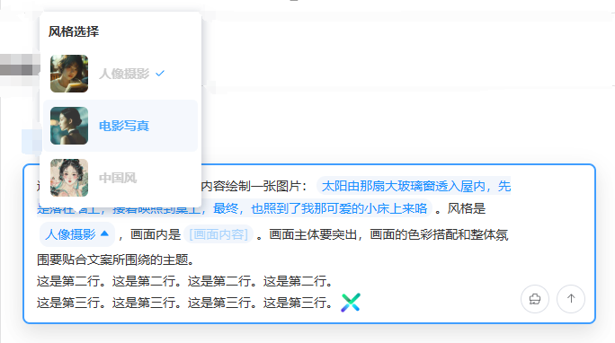
混合标签覆盖写入
通过 组件 Ref 实例的 setMixTags 方法设置混合标签,混合标签会覆盖写入已有的内容。
<script setup lang="ts">
import type { SelectTag } from 'vue-element-plus-x/types/EditorSender';
import { ref } from 'vue';

const senderRef = ref();

const selectTagsArr = ref<SelectTag[]>([
  {
    dialogTitle: '风格选择',
    key: 'style',
    options: [
      {
        id: '1',
        name: '人像摄影',
        preview: 'https://www.jianfv.top/style/style1.webp'
      },
      {
        id: '2',
        name: '电影写真',
        preview: 'https://www.jianfv.top/style/style2.webp'
      },
      {
        id: '3',
        name: '中国风',
        preview: 'https://www.jianfv.top/style/style3.webp'
      }
    ]
  }
]);

function setMixTags() {
  senderRef.value.setMixTags([
    [
      {
        type: 'gridInput',
        value: '这是第一行,请根据以下文案内容绘制一张图片:'
      },
      {
        type: 'inputTag',
        key: 'content',
        placeholder: '[文案内容]',
        value:
          '太阳由那扇大玻璃窗透入屋内,先是落在墙上,接着映照到桌上,最终,也照到了我那可爱的小床上来咯'
      },
      {
        type: 'gridInput',
        value: '。风格是'
      },
      {
        type: 'selectTag',
        key: 'style',
        value: '1'
      },
      {
        type: 'gridInput',
        value: ',画面内是'
      },
      {
        type: 'inputTag',
        key: 'content',
        placeholder: '[画面内容]',
        value: '光从大落地窗照进房间内,照在墙面、地板、桌子、床上'
      },
      {
        type: 'gridInput',
        value:
          '。画面主体要突出,画面的色彩搭配和整体氛围要贴合文案所围绕的主题。'
      }
    ],
    [
      {
        type: 'gridInput',
        value: '这是第二行。'.repeat(4)
      }
    ],
    [
      {
        type: 'gridInput',
        value: '这是第三行。'.repeat(4)
      },
      {
        type: 'htmlTag',
        value:
          '<img class="img-tag" src="https://cdn.element-plus-x.com/element-plus-x.png" alt="">'
      }
    ]
  ]);
}
</script>

<template>
  <div style="display: flex; flex-direction: column; gap: 12px">
    <div style="display: flex">
      <el-button dark type="primary" plain @click="setMixTags">
        混合标签覆盖写入
      </el-button>
    </div>

    <EditorSender ref="senderRef" clearable :select-list="selectTagsArr" />
  </div>
</template>

<style scoped lang="less">
:deep(.at-select) {
  cursor: pointer;
  svg {
    display: inline-block;
  }
}
:deep(.img-tag) {
  width: 24px;
  height: 24px;
  vertical-align: bottom;
  display: inline-block;
}
</style>2
3
4
5
6
7
8
9
10
11
12
13
14
15
16
17
18
19
20
21
22
23
24
25
26
27
28
29
30
31
32
33
34
35
36
37
38
39
40
41
42
43
44
45
46
47
48
49
50
51
52
53
54
55
56
57
58
59
60
61
62
63
64
65
66
67
68
69
70
71
72
73
74
75
76
77
78
79
80
81
82
83
84
85
86
87
88
89
90
91
92
93
94
95
96
97
98
99
100
101
102
103
104
105
106
107
108
109
110
111
112
113
114
115
116
前置提示标签
通过 组件 Ref 实例的 openTipTag 和 closeTipTag 方法打开和关闭前置提示标签。
<script setup lang="ts">
import { ref } from 'vue';

const senderRef = ref();
</script>

<template>
  <div style="display: flex; flex-direction: column; gap: 12px">
    <div style="display: flex">
      <el-button
        dark
        type="primary"
        plain
        @click="
          senderRef?.openTipTag({
            tagLabel: '图像生成',
            popoverLabel: '点击退出技能'
          })
        "
      >
        打开前置提示标签
      </el-button>
      <el-button dark type="primary" plain @click="senderRef?.closeTipTag()">
        关闭前置提示标签
      </el-button>
    </div>

    <EditorSender ref="senderRef" clearable />
  </div>
</template>

<style scoped lang="less">
:deep(.at-select) {
  cursor: pointer;

  svg {
    display: inline-block;
  }
}

:deep(.img-tag) {
  width: 24px;
  height: 24px;
  vertical-align: bottom;
  display: inline-block;
}

// 样式穿透处理 (解决前置标签和输入框内容的间距问题)
:deep(.el-editor-sender-content) {
  padding-top: 0 !important;
  .el-editor-sender-chat,
  .chat-tip-wrap,
  .chat-placeholder-wrap,
  .el-editor-sender-action-list-presets {
    padding-top: 12px !important;
  }
}
</style>2
3
4
5
6
7
8
9
10
11
12
13
14
15
16
17
18
19
20
21
22
23
24
25
26
27
28
29
30
31
32
33
34
35
36
37
38
39
40
41
42
43
44
45
46
47
48
49
50
51
52
53
54
55
56
57
58
异步加载 @成员
通过 asyncMatchFun 属性配置异步匹配函数。 @ 触发用户标签弹窗。
<script setup lang="ts">
import { ref } from 'vue';

const senderRef = ref();

// 异步匹配@人员
async function asyncMatchUser(searchVal: string) {
  console.log(searchVal, '在@之后输入的内容');
  // 模拟调用接口,返回 用户列表
  return [
    { id: '1', name: '张三' },
    { id: '2', name: '李四' }
  ];
}
</script>

<template>
  <div style="display: flex; flex-direction: column; gap: 12px">
    <div style="display: flex">
      <EditorSender
        ref="senderRef"
        placeholder="@ 符号触发用户选择"
        clearable
        :async-match-fun="asyncMatchUser"
      />
    </div>
  </div>
</template>

<style scoped lang="less">
:deep(.at-select) {
  cursor: pointer;
  svg {
    display: inline-block;
  }
}
</style>2
3
4
5
6
7
8
9
10
11
12
13
14
15
16
17
18
19
20
21
22
23
24
25
26
27
28
29
30
31
32
33
34
35
36
37
自定义提及弹框
通过 asyncMatchFun 属性配置异步匹配函数。 @ 触发用户标签弹窗。
<script setup lang="ts">
import type { TagInfo, UserInfo } from 'vue-element-plus-x/types/EditorSender';
import { ref } from 'vue';
import { EditorSender } from 'vue-element-plus-x';

const editorRef = ref<InstanceType<typeof EditorSender>>();
// 自定义@弹窗相关逻辑
const userList = ref([
  {
    id: '5',
    name: '张三丰'
  },
  {
    id: '1',
    name: '张三'
  },
  {
    id: '2',
    name: '李四'
  },
  {
    id: '3',
    name: '王五'
  },
  {
    id: '4',
    name: '马六'
  }
]);
const dialogUserVisible = ref(false);
function showAtDialog() {
  dialogUserVisible.value = true;
}
function checkUser(user: UserInfo) {
  editorRef.value?.customSetUser(user);
  dialogUserVisible.value = false;
}

// 自定义触发符相关逻辑
const customTrigger = ref([
  {
    dialogTitle: '群话题',
    prefix: '#',
    tagList: [
      { id: 'ht1', name: '话题一' },
      { id: 'ht2', name: '话题二' }
    ]
  },
  {
    dialogTitle: '群工具',
    prefix: '!',
    tagList: [
      { id: 'gj1', name: '工具一' },
      { id: 'gj2', name: '工具二' }
    ]
  }
]);
const dialogCustomVisible = ref(false);
const viewPrefix = ref('');
function showTagDialog(prefix: string) {
  viewPrefix.value = prefix;
  dialogCustomVisible.value = true;
}
function checkTag(tag: TagInfo) {
  editorRef.value?.customSetTag(viewPrefix.value, tag);
  dialogCustomVisible.value = false;
}

// 自定义选择标签相关逻辑
const selectList = ref([
  {
    dialogTitle: '风格选择',
    key: 'style',
    options: [
      {
        id: '1',
        name: '人像摄影',
        preview: 'https://www.jianfv.top/style/style1.webp'
      },
      {
        id: '2',
        name: '电影写真',
        preview: 'https://www.jianfv.top/style/style2.webp'
      },
      {
        id: '3',
        name: '中国风',
        preview: 'https://www.jianfv.top/style/style3.webp'
      }
    ]
  }
]);
const viewKey = ref('');
const dialogSelectVisible = ref(false);
const currentSelectElm = ref<HTMLElement>();
function showSelectDialog(key: string, elm?: HTMLElement) {
  viewKey.value = key;
  // 有elm值说明内部聊天框唤起
  currentSelectElm.value = elm;
  dialogSelectVisible.value = true;
}
function checkSelect(tag: TagInfo) {
  // 没有 currentSelectElm 说明是外部调用走插入逻辑
  if (!currentSelectElm.value) {
    editorRef.value?.setSelectTag(viewKey.value, tag.id);
  } else {
    // 有值走标签更新方法
    editorRef.value?.updateSelectTag(currentSelectElm.value, tag);
  }
  dialogSelectVisible.value = false;
}
</script>

<template>
  <div style="display: flex; flex-direction: column; gap: 12px">
    <EditorSender
      ref="editorRef"
      placeholder="这里是自定义弹窗,你可以试着输入@,!,#这些触发符号"
      :custom-style="{ maxHeight: '240px' }"
      :custom-dialog="true"
      :select-list="selectList"
      :user-list="userList"
      :custom-trigger="customTrigger"
      @show-at-dialog="showAtDialog"
      @show-tag-dialog="showTagDialog"
      @show-select-dialog="showSelectDialog"
    />

    <el-dialog
      v-model="dialogUserVisible"
      title="自定义人员选择弹窗"
      width="500"
    >
      <p v-for="user of userList" :key="user.id" @click="checkUser(user)">
        {{ user.name }}
      </p>
    </el-dialog>

    <el-dialog
      v-model="dialogCustomVisible"
      title="自定义触发符号选择弹窗"
      width="500"
    >
      <template v-for="option of customTrigger" :key="option.prefix">
        <div v-if="option.prefix === viewPrefix">
          <p v-for="tag of option.tagList" :key="tag.id" @click="checkTag(tag)">
            {{ tag.name }}
          </p>
        </div>
      </template>
    </el-dialog>

    <el-dialog
      v-model="dialogSelectVisible"
      title="自定义选择标签弹窗"
      width="500"
    >
      <template v-for="option of selectList" :key="option.key">
        <div v-if="option.key === viewKey">
          <p
            v-for="tag of option.options"
            :key="tag.id"
            @click="checkSelect(tag)"
          >
            {{ tag.name }}
          </p>
        </div>
      </template>
    </el-dialog>
  </div>
</template>

<style scoped lang="less">
:deep(.at-select) {
  cursor: pointer;
  svg {
    display: inline-block;
  }
}
</style>2
3
4
5
6
7
8
9
10
11
12
13
14
15
16
17
18
19
20
21
22
23
24
25
26
27
28
29
30
31
32
33
34
35
36
37
38
39
40
41
42
43
44
45
46
47
48
49
50
51
52
53
54
55
56
57
58
59
60
61
62
63
64
65
66
67
68
69
70
71
72
73
74
75
76
77
78
79
80
81
82
83
84
85
86
87
88
89
90
91
92
93
94
95
96
97
98
99
100
101
102
103
104
105
106
107
108
109
110
111
112
113
114
115
116
117
118
119
120
121
122
123
124
125
126
127
128
129
130
131
132
133
134
135
136
137
138
139
140
141
142
143
144
145
146
147
148
149
150
151
152
153
154
155
156
157
158
159
160
161
162
163
164
165
166
167
168
169
170
171
172
173
174
175
176
177
178
179
180
设备类型 pc/h5
使用 device 属性,设置设备类型,默认是 pc
📌 Warning
传入 h5 时,弹出选择功能的交互,需要注意参考自定义弹出选择功能实现交互
<script setup lang="ts">
import type { UserInfo } from 'vue-element-plus-x/types/EditorSender';
import { EditorSender } from 'vue-element-plus-x';

const senderRef = ref<InstanceType<typeof EditorSender>>();

const userList = ref([
  {
    id: '5',
    name: '张三丰'
  },
  {
    id: '1',
    name: '张三'
  },
  {
    id: '2',
    name: '李四'
  },
  {
    id: '3',
    name: '王五'
  },
  {
    id: '4',
    name: '马六'
  }
]);
const dialogUserVisible = ref(false);
function showAtDialog() {
  dialogUserVisible.value = true;
}
function checkUser(user: UserInfo) {
  senderRef.value?.customSetUser(user);
  dialogUserVisible.value = false;
}
</script>

<template>
  <div style="display: flex; flex-direction: column; gap: 12px">
    <EditorSender
      ref="senderRef"
      placeholder="这里是自定义弹窗,你可以 在 h5 环境中,试着输入@触发人员选择弹窗"
      :custom-style="{ maxHeight: '240px' }"
      :custom-dialog="true"
      :user-list="userList"
      @show-at-dialog="showAtDialog"
    />

    <el-dialog
      v-model="dialogUserVisible"
      title="自定义人员选择弹窗"
      width="500"
    >
      <p v-for="user of userList" :key="user.id" @click="checkUser(user)">
        {{ user.name }}
      </p>
    </el-dialog>
  </div>
</template>2
3
4
5
6
7
8
9
10
11
12
13
14
15
16
17
18
19
20
21
22
23
24
25
26
27
28
29
30
31
32
33
34
35
36
37
38
39
40
41
42
43
44
45
46
47
48
49
50
51
52
53
54
55
56
57
58
59
60
属性
| 属性名 | 类型 | 是否必填 | 默认值 | 说明 |
|---|---|---|---|---|
placeholder | String | 否 | '请输入内容' | 输入框的提示语文本 |
device | 'pc' | 'h5' | 否 | 'pc' | 使用编辑器的设备类型,PC端内置丰富的弹出选择功能,H5端需参考自定义弹窗实现 |
autoFocus | Boolean | 否 | false | 是否在组件挂载后自动聚焦到输入框 |
variant | 'default' | 'updown' | 否 | 'default' | 输入框的变体类型,default为水平布局,updown为垂直布局 |
userList | UserInfo[] | 否 | [] | @提及功能的用户列表 |
customTrigger | CustomTag[] | 否 | [] | 扩展自定义弹窗的触发配置列表 |
selectList | SelectTag[] | 否 | [] | 配置标签下拉选择的选项列表 |
maxLength | Number | 否 | undefined | 限制输入框的最大字数,性能开销较大,非必要不建议设置 |
submitType | 'enter' | 'shiftEnter' | 否 | 'enter' | 控制换行与提交模式:'enter'为Enter提交、Shift+Enter换行;'shiftEnter'为Shift+Enter提交、Enter换行 |
customStyle | Record<string, any> | 否 | {} | 用于修改输入框的样式 |
loading | Boolean | 否 | false | 发送按钮的加载状态,为true时显示加载动画 |
disabled | Boolean | 否 | false | 是否禁用输入框,禁用后无法输入和操作 |
clearable | Boolean | 否 | false | 是否显示清空按钮 |
headerAnimationTimer | Number | 否 | 300 | 头部展开/收起动画的时长,单位为ms |
asyncMatchFun | (searchVal: string) => Promise<UserInfo[]> | 否 | undefined | 异步加载群成员的方法,用于@提及功能的远程搜索 |
customDialog | Boolean | 否 | false | 是否启用自定义弹窗,开启后内部弹窗将不会创建,需自行实现弹窗逻辑 |
事件
| 事件名 | 说明 | 回调参数 |
|---|---|---|
submit | 提交内容时触发 | payload: SubmitResult - 包含提交的各类内容 |
change | 输入内容发生变化时触发 | 无 |
cancel | 取消加载状态时触发 | 无 |
showAtDialog | 显示@用户弹窗时触发 | 无 |
showSelectDialog | 显示选择标签弹窗时触发 | key: string - 标签键名, elm: HTMLElement - 触发元素 |
showTagDialog | 显示自定义标签弹窗时触发 | prefix: string - 标签前缀 |
Ref 实例方法
| 方法名 | 类型 | 描述 |
|---|---|---|
getCurrentValue | () => SubmitResult | 获取当前输入框的内容,包括文本、HTML和各类标签信息 |
focusToStart | () => void | 将光标聚焦到文本最前方 |
focusToEnd | () => void | 将光标聚焦到文本最后方 |
blur | () => void | 移除输入框的焦点 |
selectAll | () => void | 全选输入框内容 |
clear | (txt?: string) => void | 清空输入框内容,可选参数txt为清空后插入的文本 |
setSelectTag | (key: string, tagId: string) => void | 插入一个选择标签 |
setInputTag | (key: string, placeholder: string, defaultValue?: string) => void | 插入一个输入标签 |
setUserTag | (userId: string) => void | 插入一个@提及标签 |
setCustomTag | (prefix: string, id: string) => void | 插入一个自定义触发符标签 |
setMixTags | (tags: MixTag[][]) => void | 混合式插入多种标签 |
setHtml | (html: string) => void | 在当前光标处插入HTML片段(建议使用行内或行内块元素) |
setText | (txt: string) => void | 在当前光标处插入文本 |
openSelectDialog | (option: SelectDialogOption) => void | 外部调用唤起标签选择弹窗 |
customSetUser | (user: UserInfo) => void | 自定义弹窗中写入@提及标签(私有API,会自动截取触发符) |
customSetTag | (prefix: string, tag: TagInfo) => void | 自定义弹窗中写入自定义触发符号标签(私有API,会自动截取触发符) |
updateSelectTag | (elm: HTMLElement, tag: TagInfo) => void | 更新选择标签内容 |
openTipTag | (options: TipOptions) => void | 打开前置提示标签 |
closeTipTag | () => void | 关闭前置提示标签 |
chat | ChatArea 实例 | 暴露的chat实例对象 |
opNode | ChatOperateNode 实例 | 暴露的ChatNode操作对象 |
chatState | ChatState 对象 | 暴露的组件状态对象 |
插槽
| 插槽名 | 参数 | 描述 |
|---|---|---|
#header | - | 用于自定义输入框的头部内容 |
#prefix | - | 用于自定义输入框的前缀内容 |
#action-list | - | 用于自定义输入框的操作列表内容 |
#footer | - | 用于自定义输入框的底部内容 |
功能特性
全类型标签引擎:无缝支持@用户、选择标签、自定义标签等多类型标记,标签插入/更新/管理一键搞定,满足复杂内容标记需求。
跨设备自适应交互:PC端内置弹窗系统,H5端支持自定义弹窗,自动适配不同设备操作习惯,兼顾原生体验与定制自由。